Return

Unifying the brand and getting
it ready for use abroad.

GRiT

Czech IT company

GRiT develops its own cloud services for EDI, electronic invoicing and warehouse management, saving companies time on routine work and speeding up the flow of documents, goods and money. Now it's heading into more foreign markets, and it needed a brand that holds up there too.

No revolution, just evolution. Marketing started using the new brand right after handover.

We started with a strategy and a proposed development roadmap. In practice, though, we focused on what the company needed first: we simplified the brand, moved it forward step by step and gave it rules and a clear direction.


The simplified GRiT brand symbol on a light background
White GRiT logotype on a blue gradient
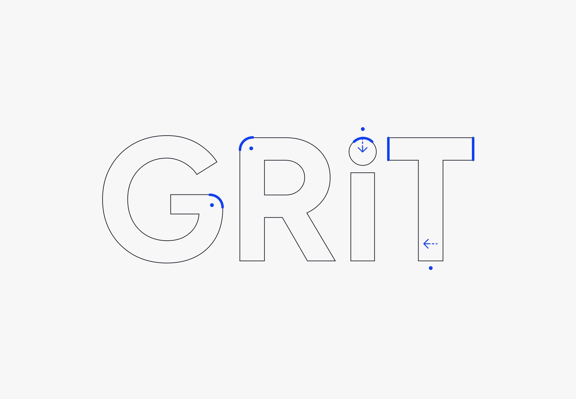
Outline construction of the GRiT logotype with the lettering adjustments marked
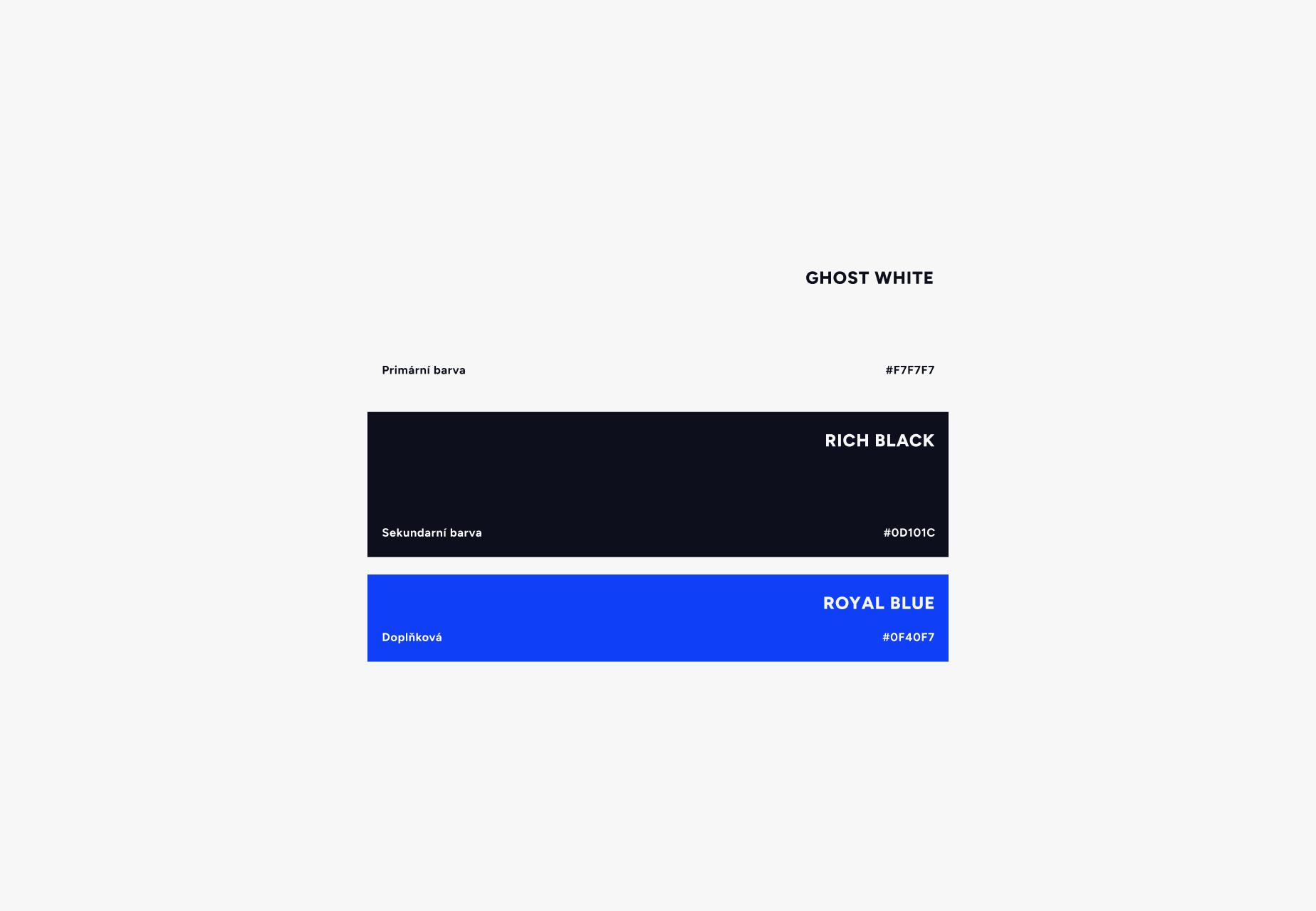
The core brand colours — ghost white, rich black and royal blue
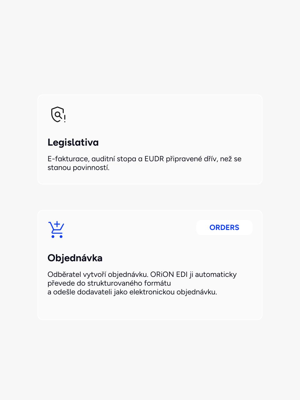
Website cards for Legislation and Order, with icons and an ORDERS label
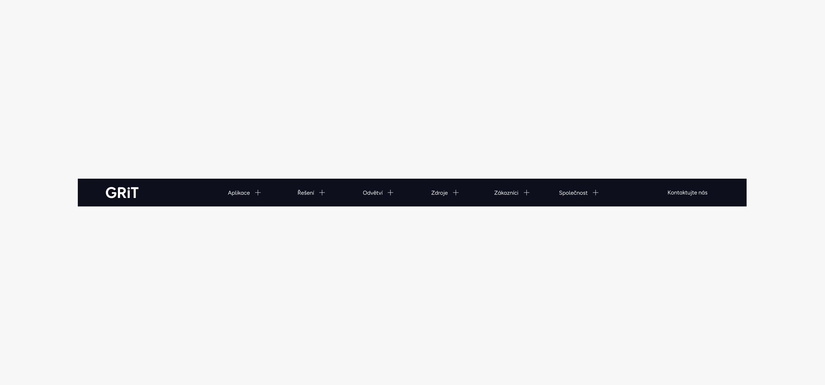
Dark header menu on the GRiT website with the new logotype

Templates for online and offline communication and a set of assets are up and running.
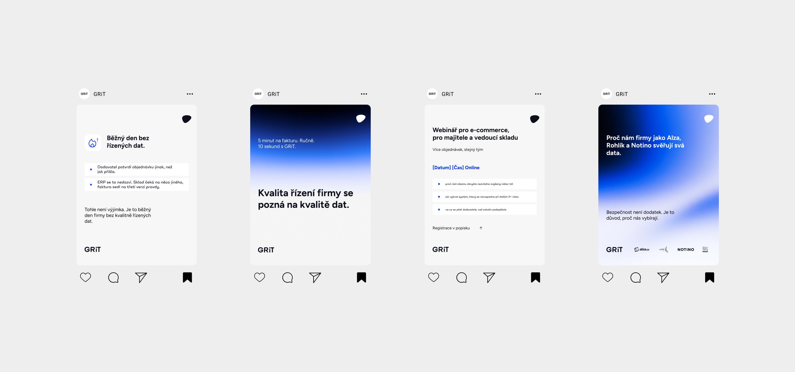
Four GRiT social media post templates
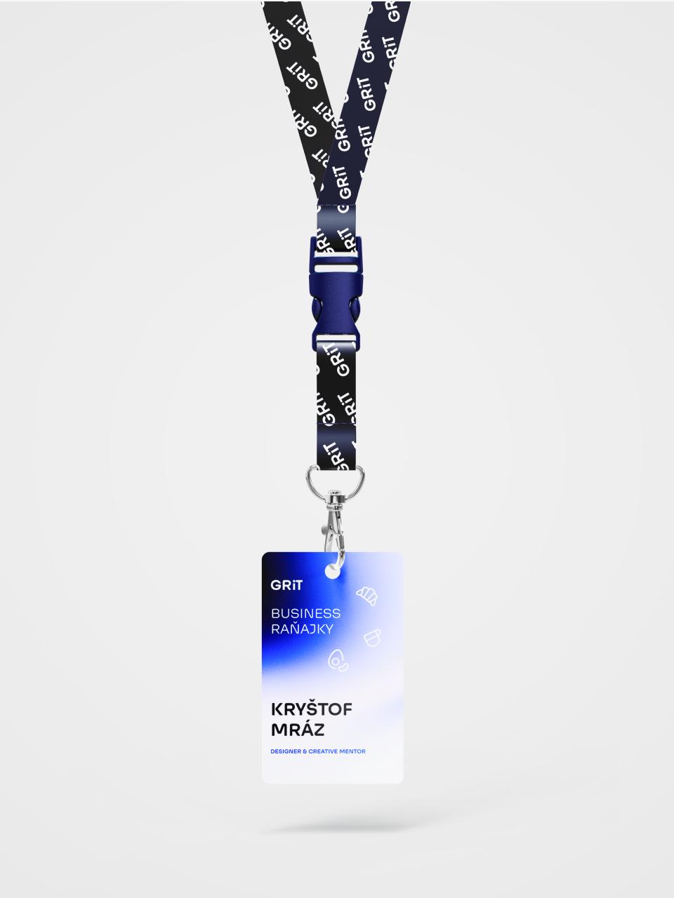
GRiT name badge and lanyard for a Business Breakfast event
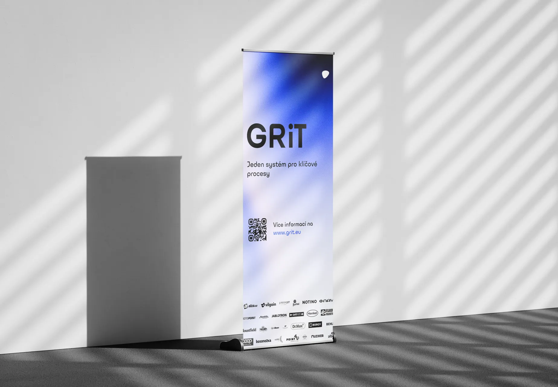
GRiT roll-up banner with a claim, a QR code and customer logos
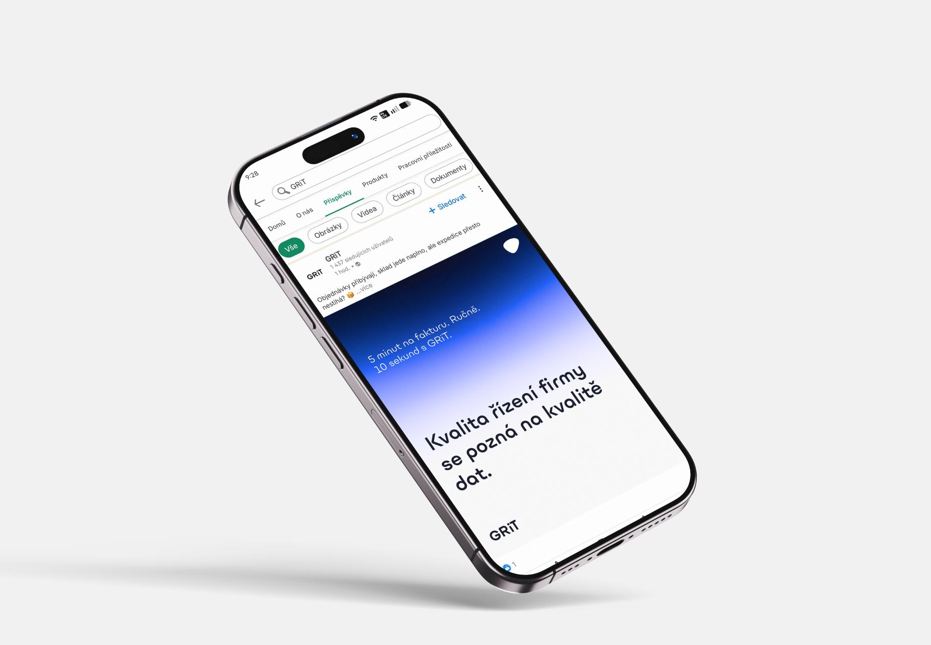
A GRiT LinkedIn post on a phone
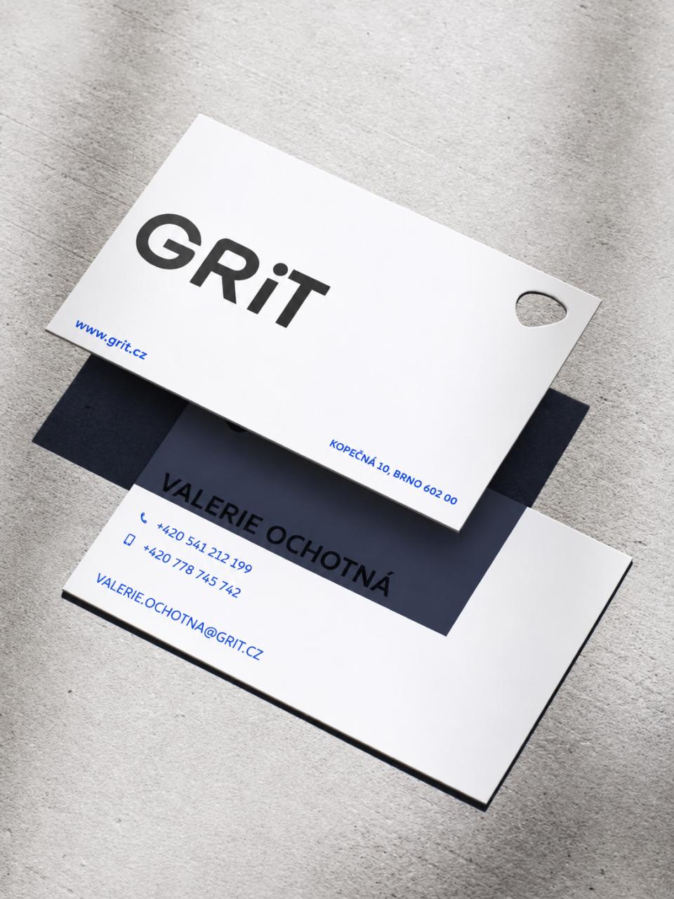
GRiT business cards with a cut-out in the shape of the brand symbol
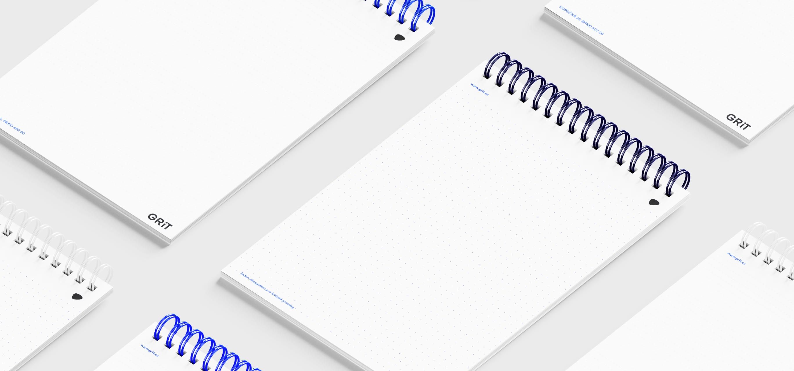
Spiral-bound GRiT notepads with the logotype and symbol

To make it all easier to use, we created a manual, or really more of a brief, for AI tools and LLM models that helps produce content and stay within the design system.
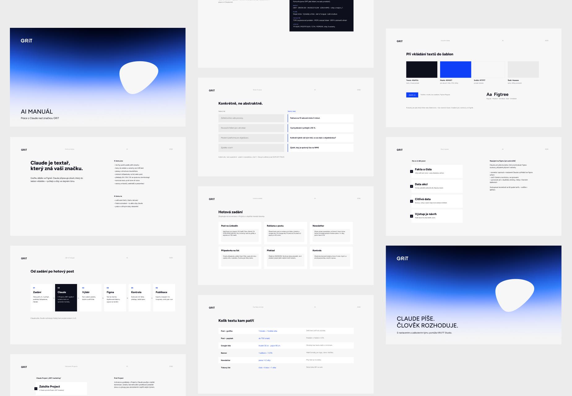
Pages from the GRiT AI manual for working with Claude
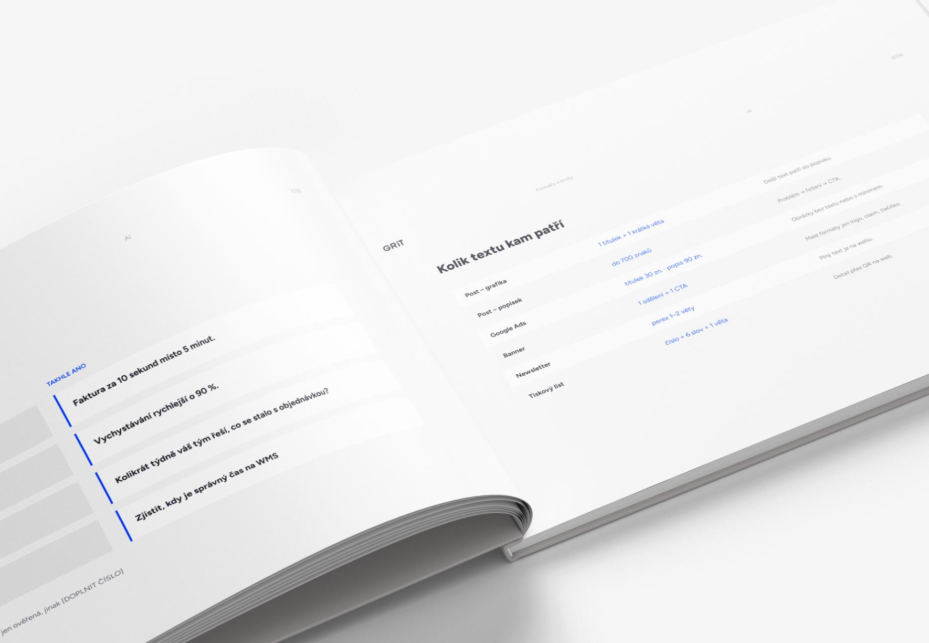
The open GRiT AI manual, showing tone rules and text limits

Nikola Nekudova

“Reliability and professionalism. It has always been, and still is, a pleasure to work together 🙌 …”

Daniela Ludvová

“Great collaboration, fast communication and a professional approach :)”


So... Are you ready to make your dream brand?

Krutý Studiocruel [ˈkruːl]
Let's Talk